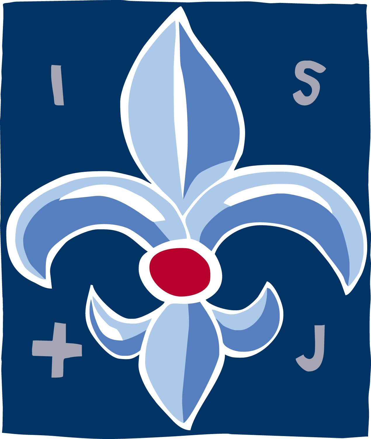
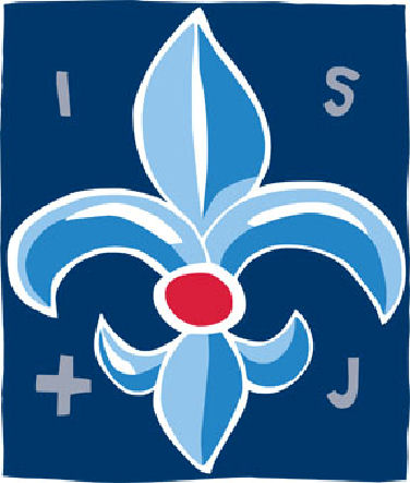
In connection with the preparation of a new street sign for the school, we felt that our old logo – a French lily – needed a makeover. Therefore, in the summer of 2009, we initiated a collaboration with graphic designer Kim Brostrøm, and you can see the great result here. (pictured right)
With our logo, we want to increase continuity and recognition with regards to our communication with the community. The logo and the design programme as a whole supports our main task: To continue to offer a caring and ambitious learning environment for our students and parents.
As can be seen,the logo has the main motif of the French lily. We have chosen to stick with the lily, as it in a special way express our school´s history, which is rooted in the foundation of the school by the Saint Joseph Sisters of Chambery.
The French lily (Fleur de Lis) is a very popular symbol in heraldry and a symbol with a long history. In fact, it is not a lily at all, but an iris. When the Franks King Clovis I, triumphed over the Visigoths in 507, he chose the iris as the French symbol, as he knew them well from his home region along the river Senne in Belgium. Clovis I was baptized and considered France’s founder, and thus forever immortalised the symbol as a tribute to the French kings and France. Clovis was the latin translation of Louis or Louis, the name given to the King of France. Lily (or iris) is the symbol of purity, innocence, the Virgin Mary and the holy trinity. It was used as scouts symbol by Baden-Powell, and represents several cities coat of arms; including, Odense, Glostrup and Milan.
The logo is drawn with ink and brush to show spontaneity and creativity – an attempt to reconcile the coat of arms and heraldry with a modern learning environment based upon creative formation. The logo type is set with the classic Garamond font, one of the Renaissance popular fonts utilized by scribes, but here it stands in a modern version. Above all, this font expresses quality and tradition.
In the logo’s center one can see perhaps a child; or possibly the visage of an angel? With this we would like to signal the following: We strive to offer a learning environment where each child is at the center; an environment where children are included in trusting relationships based upon open dialogue, and where the teaching staff has the desire and skills necessary to “open up the world” for each child. The angel can be seen as an expression of the school’s Catholic identity. Regardless of one´s belifs, attitudes and actions, every human being has an absolute worth that is rooted in God.
A special thanks to Kim Brostrøm for an inspiring collaboration and fantastic result!
Peter Franklin
Headmaster
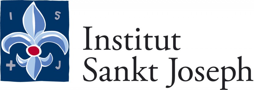
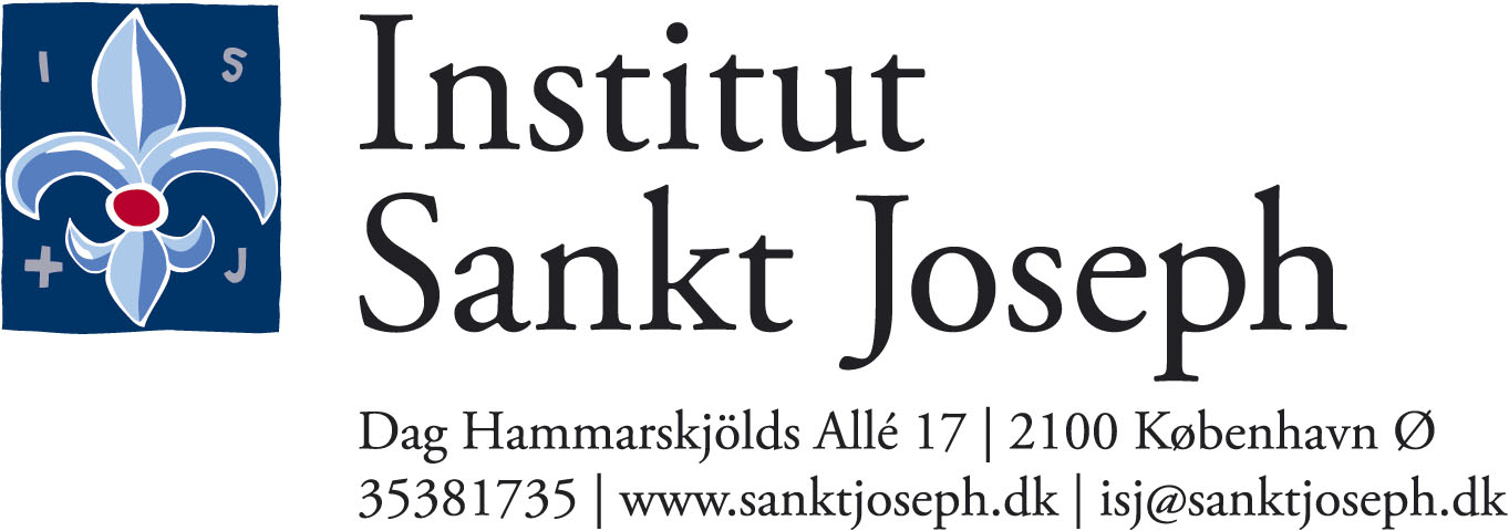
Logos for every day use:
Here are some of the most used versions of the school logo, with and without the name.
The logos here are jpg-files for everyday use in Word, video, student work, etc.
Click on the desired logo and save picture as..